
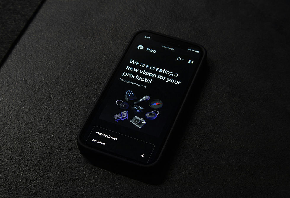
📱 Why Having a Mobile-Friendly Website Is Critical for Your Business
- Joshua Preston
- Apr 14
- 2 min read

When was the last time you visited a website on your phone?
Now ask yourself…
When was the last time you checked your own website on mobile?
In today’s digital world, your customers are no longer browsing on desktops—they’re on their phones. If your website isn’t built for mobile, you’re not just behind… you’re losing business.
📊 Mobile Traffic Is Dominating
Over half of all web traffic now comes from mobile devices—and that number continues to grow.
That means:
Most people find your business on their phone
Most people judge your business on their phone
Most people decide to contact you (or not) on their phone
👉 Your mobile experience is your business’s first impression.
🚨 What Happens When Your Website Isn’t Mobile-Friendly
If your website isn’t optimized for mobile, users will notice immediately.
Common issues:
Slow load times
Text that’s too small
Buttons that are hard to click
Layouts that don’t fit the screen
And here’s what happens next…
They leave.
❌ Lost Customers in Seconds
Mobile users have zero patience.
If your site is confusing or slow:
They won’t try to figure it out
They won’t come back later
They’ll go straight to a competitor
👉 No calls. No clicks. No conversions.
💡 Your Website Is Your First Impression
Before someone calls you or visits your business, they check your website.
If your mobile site:
Looks outdated
Feels clunky
Doesn’t work smoothly
It sends one message:
“This business isn’t professional.”
Even if that’s not true.
⚡ What a Mobile-Friendly Website Should Do
A high-performing mobile website should be:
✅ Fast
Pages should load in under 3 seconds.
✅ Clean & Easy to Navigate
Users should instantly know:
What you do
Where to go
How to take action
✅ Built for Touch
Buttons should be:
Easy to tap
Clearly visible
Placed where users expect them
✅ Conversion-Focused
Every mobile site should guide users toward:
Calling your business
Filling out a form
Taking the next step
📈 Mobile Optimization = More Leads
When your website works well on mobile:
Users stay longer
Engagement increases
Conversion rates go up
👉 A better experience leads to more customers.
🔍 Mobile-Friendly Websites Help SEO
Google prioritizes mobile-friendly websites in search rankings.
That means:
Better mobile experience = better visibility
Faster load times = higher rankings
Optimized design = more traffic
👉 If your site isn’t mobile-friendly, you’re harder to find.
⚠️ The Reality
Most small businesses:
Haven’t checked their mobile site in months
Don’t realize how bad the experience is
Are losing customers without knowing it
Meanwhile, competitors with better websites are capturing those leads.
🚀 How to Fix Your Website
If your site isn’t mobile-friendly, here’s where to start:
Test your website on your phone
Improve load speed
Simplify your layout
Make navigation easy
Add clear calls-to-action
👉 Small changes can make a big difference.
💬 Final Thoughts
Your website isn’t just a website…
It’s your first impression, your credibility, and your sales tool—all in one.
And in today’s world, that experience happens on mobile.
If your site doesn’t perform perfectly on a phone, it’s not just a missed opportunity…
It’s lost business.
🚀 Want a Website That Actually Works?
3116 Marketing builds fast, mobile-friendly, high-converting websites designed to turn visitors into customers.


Comments